Discover the art of animated insights and let your data tell its story! Unlock the magic of viz animations: gain clarity and insights as your data comes alive! Dive into the blog to embrace the fascinating world of visualizing dynamic data.
Introduction
Explore, understand, and present your data like never before with Tableau viz animations, telling powerful and captivating data stories through dynamic visualizations. Animations elevate your data by putting it in motion, taking your work to new heights. Discover how viz animations serve diverse use cases, spanning analysis, presentation, and data storytelling.
Seamlessly transform data over time by pairing animations with the page’s shelf. Gain insights into how dimensions reorganize after sorting and use animations to guide your audience’s focus during presentations. Learn how to enable animations, unlock their full potential with expert tips, and see inspiring examples of our favorite use cases.
What makes animations essential in data visualization?
In the 1990s, experts in the field were beginning to explore the untapped analytical potential of motion. Today, we know that thoughtfully applied animations can significantly enhance understanding. As a pre-attentive visual property, motion draws attention to changes while de-emphasizing what remains constant. This holds true in Tableau as well. Without animations, alterations like adjusting a date filter result in scatterplot marks abruptly jumping to new positions, making it challenging to discern what changed and why.
In contrast, smooth animations connect the dots, making it easier to identify and comprehend changes, such as outliers emerging, sudden value spikes or dips, and the appearance of data clusters. You can visualize how bars grow, shrink, or re-sort about one another or even track the path of individual data points. Animations clarify your analysis by directing focus to crucial insights, helping you and your audience understand the underlying dynamics of evolving data.
How to leverage viz animations
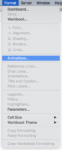
By default, animations are enabled in your Tableau workbooks. However, if you come across a disabled workbook, you can easily activate animations by navigating to Format > Animations… and seizing the full potential of dynamic data visualization.
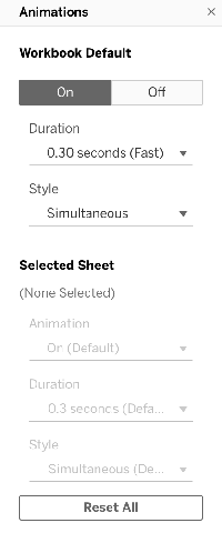
You will find an animation formatting pane on the left side. Activate animations by setting the Workbook Default to “On“. Once enabled, feel free to explore and witness the captivating effects of the animations in action.
To replay an animation, click the “Replay Animation” button in the Tableau toolbar. Please note that this button will be enabled only if there has been at least one animation occurrence in the active session of the visualization. When clicked, it will replay the last played animation. Additionally, you can adjust the speed of the ‘replay’ by using the dropdown menu next to the button.
Starting from Tableau 2021.4, you can replay animations at original, half, or double speed.
Tips & Tricks for Viz Animations
Now that you have enabled animations, it is time to leverage their power. Here are some ways to get started:
1. Simply turn them on: Viz animations are native and automatic, so there is no need to write code or configure them further. You have complete creative control to adjust your desired style and duration.
2. Give old workbooks a motion makeover: Enable animations in your existing workbooks to breathe new life into once-static dashboards and uncover fresh insights. Even your Makeover Monday entries on Tableau Public can benefit from a visual revamp.
3. Explore different mark types: Tableau automatically animates various visualizations. As of 2020.1, it supports animations for bars, lines, circles, squares, shapes, density (Desktop-only), area, filled maps, Gantt charts, and mark labels, with more elements in future releases.
4. Experiment with different actions: Once animations are on, they automatically work for any underlying data changes. Test various actions, such as applying or changing filters, setting quick filters or parameters, sorting a viz, modifying axis properties, using filter actions, and more. Animations can significantly enhance cognition, aid analysis, and guide attention.
5. Customize the animation style: In the formatting pane, you can fine-tune the animation style for greater creative control. The simultaneous style plays every animation simultaneously, which is ideal for showing value changes in line charts, app-like dashboards, and spike maps. On the other hand, the sequential style goes step-by-step, perfect for understanding complex concepts and delivering presentations.
6. Adjust the duration: Tailor the duration of animations by using default settings or setting a custom duration. Faster animations create a responsive dashboard feel, while slower ones can be more demonstrative and suitable for specific audiences.
7. Fine-tune animations for your dashboard: You can configure animations for entire workbooks or individual sheets. Use the animation formatting pane to apply animation style and duration to specific sheets within a dashboard, making applying different settings to multiple visualizations easier.
8. Create your best practices: Viz animations offer boundless possibilities to explore and discover new ways to enhance user experiences.
Viz Animations in Action
The Tableau Community has highlighted incredible examples during the alpha and beta phases. The possibilities have exceeded expectations, from creative dashboard applications to data-driven stories and animated art.
Analysis
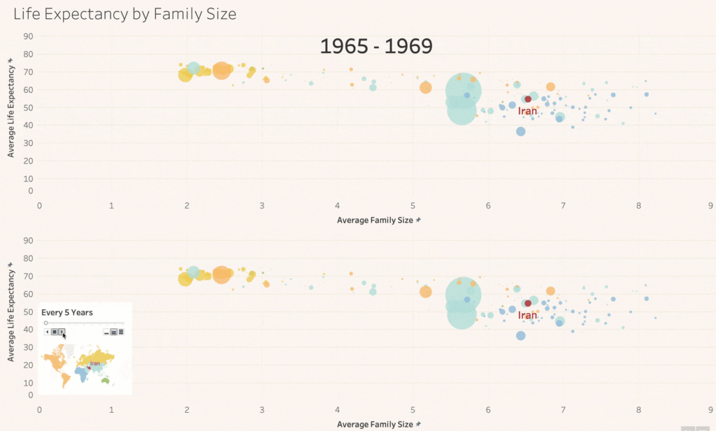
One remarkable use case is in analysis, where animations allow you to track a specific mark’s path and identify patterns quickly. Comparing an animated viz to a non-animated one, it becomes evident that animations make it significantly easier to follow a mark’s movement than other marks and observe how they interact.
Data storytelling and presentation
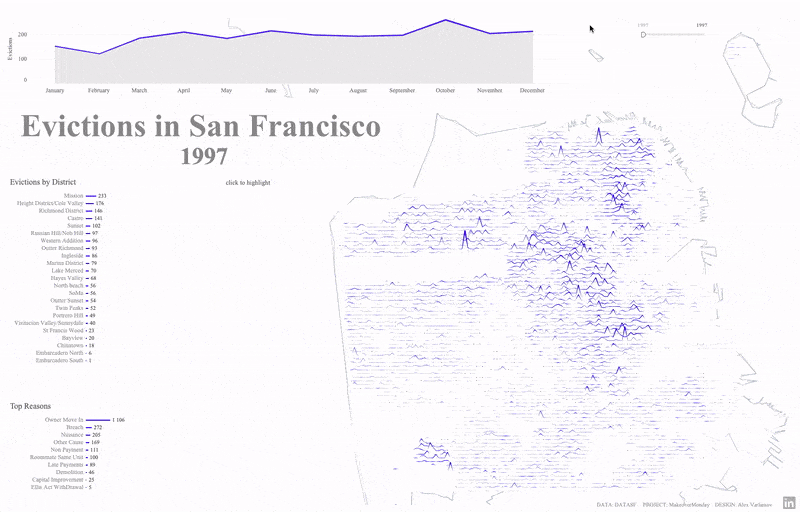
In editorial news, well-crafted data animations highlight unclear patterns and essential details. With Tableau viz animations, you can replicate this impactful approach in your reporting. For example, animations emphasize critical relationships and patterns among multiple visualizations concerning evictions in San Francisco. Without animations, it becomes challenging to discern the changes when adjusting the date filter. However, by enabling animations, the insights become clear. Districts on the bottom left reorganize themselves as geographic spikes dynamically grow and shrink, revealing the underlying dynamics of the data in a visually compelling way.
Dashboard Applications
Numerous dashboard authors take their workbooks to the next level, transforming them into immersive app-like experiences. In such cases, animations are pivotal in enhancing perceived performance, offering a responsive and polished feel. For instance, take this sales calendar date picker, where animations on the right-hand sheet smoothly zoom in and out as the date scope changes. The best part is that this happens effortlessly, requiring no additional manual intervention.
Bar Chart Races
We must recognize this fan favorite when discussing viz animations. While there are valid reasons to use them cautiously, bar chart races can serve as a captivating data storytelling tool when applied sparingly. In the past, creating such races involved various delicate hacks and workarounds, but now, with viz animations, it has become a simple and automatic feature.
Conclusion
Begin your journey with Viz animations today!
Viz animations provide a quick pathway to clear analysis and captivating data stories, harnessing our brain’s innate motion awareness to offer fresh perspectives on data understanding. Whether you are analyzing your data, presenting insights to others, or crafting sophisticated dashboard applications, the possibilities with viz animations are boundless. Embrace this exciting feature and unlock the full potential of your data visualization endeavors with Prudent.

